Med spa
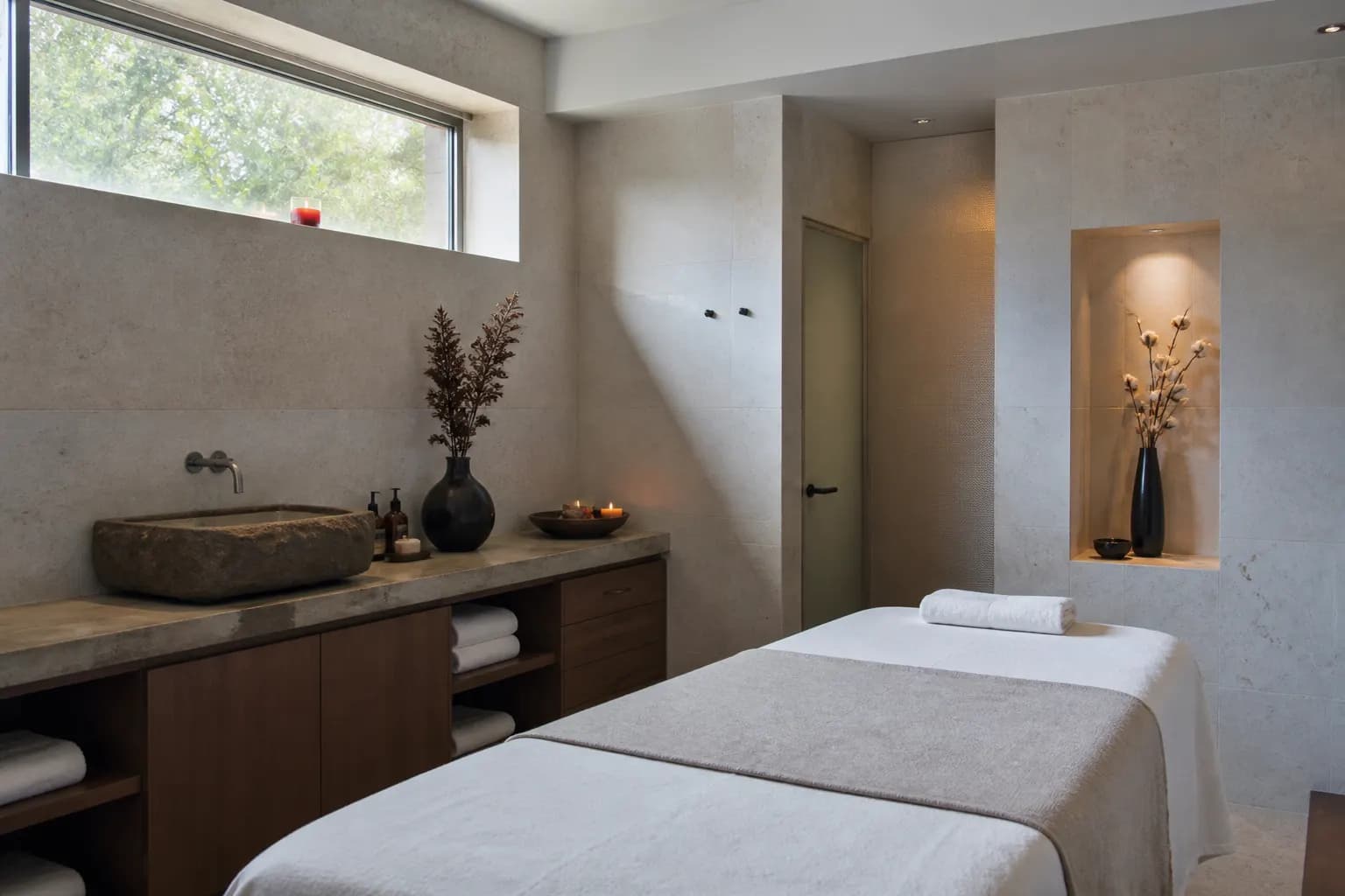
A site that books treatments, not just browses them
A clearer site and booking path that lifted relevant inquiries from people ready to book.
Mobile
First priority
6 wks
Build to launch
1 CTA
Primary action
Outcome focus
Ready-to-book leads
Inquiries with clearer intent
01 — Context
Challenge
The old site buried services and CTAs. Visitors browsed treatments but stalled before contacting the team.
02 — Method
Approach
We redesigned information architecture, treatment pages, and booking CTAs for mobile-first decision making.
03 — Results
Outcomes
- Services and pricing cues were easier to scan
- Primary booking path stayed visible on every key page
- Form fields matched how clients already asked questions
Measurement
Illustrative patterns from this engagement style
Form starts on treatment pages
Illustrative index of booking form starts after IA and CTA changes on mobile.
- 28 Pre
- 34 W1
- 42 W2
- 51 W3
- 59 W4
Checkpoint values
Same series as bars — useful for scanning week-to-week movement.
Where visitors exit
Fewer dead ends; more exits into the booking flow.
Before
- Browse and leave65%
- Call or DM20%
- Book form15%
After we rebalance
- Browse and leave35%
- Call or DM25%
- Book form40%
Charts are illustrative patterns for how we sequence and measure work in this category. They are not audited financial results or guarantees.
Visuals
Project gallery


Need a similar outcome?
Book a free audit. We will tell you whether a campaign rebuild, a product build, or a creative system is the honest next step.
Book a free audit